Velvet 0.1a
A beginner-friendly C++ GUI framework built on SFML.
Loading...
Searching...
No Matches
Quickstart

This page is a practical 5-minute guide to get a usable UI on screen.

1) Include Velvet

Use the umbrella include:

#include <velvet/core>

This includes all the core basic layout and widget components needed for velvet to function.

2) Window & Layout

The application runs inside a Window, constructed with the width, height, and the title as parameters.

Window window(float width, float height, std::string title);
Application window and main event/render loop.
Definition Window.hpp:19

Velvet uses a Stack for layout and positioning. Stacks exist in Vertical or Horizontal directions and can be declared as follows:

Stack stack(StackDirection::Horizontal, float gap); // horizontal stack
Stack stack(StackDirection::Vertical, float gap); // vertical stack
Container widget that arranges children in a row or column.
Definition Stack.hpp:27

For convenience, you can use the shorthand HStack and VStack declarations:

HStack stack(float gap); // horizontal stack
VStack stack(float gap); // vertical stack
Horizontal stack helper (StackDirection::Horizontal).
Definition Stack.hpp:394
Vertical stack helper (StackDirection::Vertical).
Definition Stack.hpp:400

gap is the spacing between child elements of the layout stacks (similar to flexbox gap in CSS)

Example:

Window window(1000, 600, "My App"); // 1000x600 window with the title "My App"
VStack root(12); // vertical stack with 12px gap
root.setPadding(16); // content padding inside stack

Create widgets and add them to layout stacks using add( ... ).

3) Add widgets

The add() function exists on both Widget and Stack. It accepts 'n' widgets or pointers to widgets.

Label title("Dashboard", {
{"fontSize", 30.f},
{"fillColor", 0x202020FFu}
});
Slider zoom(220, 0.f, 100.f);
Button reset(220, 40, "Reset");
root.add(title, &zoom); // pass in as many widgets/pointers as needed.
root.add(reset); // also works with just one element
Clickable button widget with text label.
Definition Button.hpp:28
Text display widget with simple style map support.
Definition Label.hpp:23
Horizontal draggable slider widget.
Definition Slider.hpp:12

4) Event Callbacks

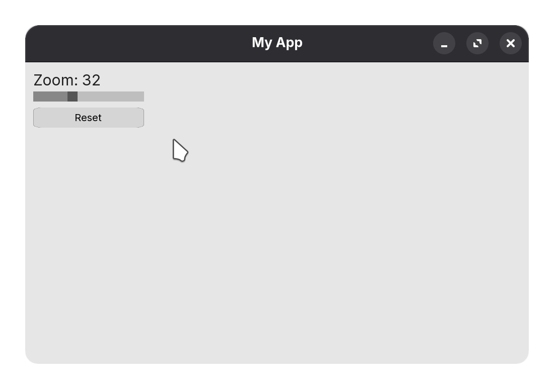
zoom in the current code so far is a Slider, which has the onchange callback:

zoom.onchange = [&](float value) {
title.setText("Zoom: " + std::to_string((int)value));
};

Similarly, Button with onclick:

reset.onclick = [&] {
title.setText("Dashboard");
};

5) Finally, compose and run

Ensure you add all the Stack layouts to the base window:

window.add(root); // adding root VStack to the window
window.run();

Altogether:

#include <velvet/core>
int main() {
// window setup
Window window(1000, 600, "Velvet");
VStack root(12);
root.setPadding(16);
// widgets
Label title("Dashboard", {
{"fontSize", 30.f},
{"fillColor", 0x202020FFu}
});
Slider zoom(220, 0.f, 100.f);
Button reset(220, 40, "Reset");
root.add(title, &zoom);
// events
zoom.onchange = [&](float value) {
title.setText("Zoom: " + std::to_string((int)value));
};
reset.onclick = [&] {
title.setText("Dashboard");
};
// composition and run
root.add(reset); // you can add widgets anywhere BEFORE adding the stack to the window/parent stack!
window.add(root);
window.run();
}

quickstart app demo

Notes about file paths

Some widgets load assets like fonts/textures with relative paths (example src/assets/...). Run your app from the project root, or provide paths that are valid for your execution directory. See Button and Label custom fonts and Image paths.

Widget Guide

Head on over to the Widget Guide to find API references on all the widgets you can use within Velvet.